Brand Dissection: Pyramid's New Look
Among the venerable American craft breweries, Pyramid has had a relatively stable brand identity and line-up. The brewery, founded in Kalama, just across the Columbia halfway between St Helens and Rainier, was actually first called Hart Brewing. The Pyramid came when they started naming their beers--first with Pyramid Pale Ale in 1984 and then Pyramid Wheaten in '85 (an important early American wheat bee r). Snow Cap came in '86 and Hefeweizen replaced Wheaten in '93--a rebrand of the wheat ale designed to respond to a certain Hefe further south. The next year they added Apricot Ale and within the first decade, Pyramid's line was already much as it is today.
The next decade were as rocky for Pyramid as they were for a number of mid-sized breweries that grew fast while the market was still immature. When the market did mature during the mid-aughts, Pyramid was stuck in a familiar dilemma. They had the reputation of an easy-drinking craft beer and their sales were supported by more casual fans who liked drinkability, not the modern hop fanciers who were launching a new generation of aggressive breweries like Stone, Dogfish Head, and Lagunitas.
Breweries can respond to this quandary in a number of ways, and Pyramid chose the sure-fire loser: trying to rebrand itself solely by changing its image. In 2009, Pyramid released catastrophically bad new design abetted by cringe-inducing names (Apricot Ale became "Audacious Apricot," Hefeweizen became "Haywire Hefeweizen")--or in their words "inject a new attitude" with "energy" and "activity." Are words like that ever accompanied by good design? But this wasn't just bad, it was brand suicide:
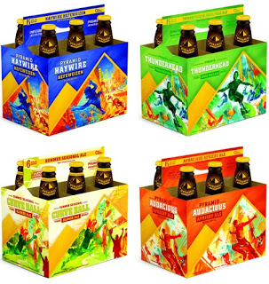
I actually awarded it a DMS Award for Worst Accomplishments in Beer (which, unfortunately, it doesn't look like I'm going to have time to compile this year) for terrible labels. The problems were many (opaque design, failure to communicate product identity, etc.), but mainly, they radically undermined the brand. Pyramid is a Northwest brewery, emphasis on brewery. The packaging made them look like a sports drink. I suppose the idea was to communicate "dynamic" to overcome the image of a staid, possibly bland product, but this beamed "corporate" and "inauthentic." It didn't seem to have anything to do with place, and it barely had anything to do with beer. A poor way to reach out to a guy stroking his chin in the supermarket beer aisle.
Forward to the Past
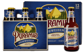
In the past month, Pyramid has rebooted the brand, and they've very wisely gone back to basics. When you're approaching 30 years in a 35-year-old industry, you want to communicate a sense of history. Beer is, more than most things, a product of place, so the brand should signal its Northwest roots. Finally, the brand should at least nod in the direction of the product itself, beer. Pyramid found salvation in the company archives, and the new label looks a whole lot like labels from the first epoch back in the 1980s:
Name
Pyramid's one of those too-clever-by-half names. For people who know their brewing history, it's a charming little nod to the past, particularly given the flagship is a wheat ale. But most people don't know Egypt had anything to do with beer, and the pyramids on the label have always been obscure. That's probably another reason the company was keen to put a snow-boarder on the label: no more answering questions about the Egyptian theme. (Ninkasi, which is even more obscure, works because people don't have any context for the name. They don't know what it means, but they don't care--it sort of sounds cool and that's good enough.)
Unfortunately, that's the brand. For over two decades, people saw pyramids on the label and whether they figured out what they allude to, they are at least familiar. Recognition is critical to branding, so if they were sticking with the name, Pyramid had to stick with the images, too. It wasn't so bad that it hampered the company from becoming one of the country's biggest.
Look
The new labels are very much in the lineage of labels the brewery used for most of its existence. The pyramids are back, the font is back, the original names are back. This is a tune-up, for sure. It's more modern, cleaner, and the colors are used to clear effect than in some earlier iterations of a similar look.
What I particularly like is that the six-pack containers really track as old fruit-crate labels--a great touch for a state that produces tons of fruit. The simplicity of the design and the colors instantly evoke decades of local design:
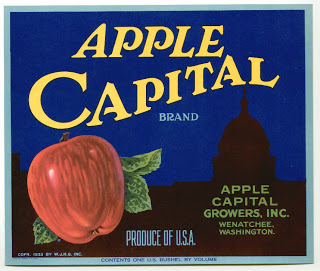 The best design works on multiple levels, and in recalling a long history of commercial design is one way of tapping into local sentiment here in the Northwest--where the brand is strongest.
Product
The last element is the product itself. When Pyramid rebranded three years ago, they just changed the names of the beer and I didn't see a lot of movement in the product line. This time, the branding comes as Pyramid solidifies its "Ignition Series" (silly name, but fine), continues to add seasonals, and plans new "exclusive" beers. Of the 14 beers on the active roster, six will debut this year. It is not yet a hugely adventuresome line, but Pyramid seems to be making a play for the beer geeks. The brewery will still be a hefeweizen house, but it may yet shed its reputation for caution.
Final Appraisal
Returning to the old brand was a great move. If you have the history Pyramid does, it's wise to use it, not flee from it. The new designs are aesthetically pleasing, and they communicate all the things Pyramid wants: history, connection to region, and quality. It's even a bit daring; after wandering away into total brand confusion, Pyramid had the presence of mind to cut its losses, retool, and return to the thing that made them the company they are. Good stuff all around.
__________________
FRUIT CRATE PHOTOS: THE LABEL MAN
 r). Snow Cap came in '86 and Hefeweizen replaced Wheaten in '93--a rebrand of the wheat ale designed to respond to a certain Hefe further south. The next year they added Apricot Ale and within the first decade, Pyramid's line was already much as it is today.
The next decade were as rocky for Pyramid as they were for a number of mid-sized breweries that grew fast while the market was still immature. When the market did mature during the mid-aughts, Pyramid was stuck in a familiar dilemma. They had the reputation of an easy-drinking craft beer and their sales were supported by more casual fans who liked drinkability, not the modern hop fanciers who were launching a new generation of aggressive breweries like Stone, Dogfish Head, and Lagunitas.
Breweries can respond to this quandary in a number of ways, and Pyramid chose the sure-fire loser: trying to rebrand itself solely by changing its image. In 2009, Pyramid released catastrophically bad new design abetted by cringe-inducing names (Apricot Ale became "Audacious Apricot," Hefeweizen became "Haywire Hefeweizen")--or in their words "inject a new attitude" with "energy" and "activity." Are words like that ever accompanied by good design? But this wasn't just bad, it was brand suicide:

I actually awarded it a DMS Award for Worst Accomplishments in Beer (which, unfortunately, it doesn't look like I'm going to have time to compile this year) for terrible labels. The problems were many (opaque design, failure to communicate product identity, etc.), but mainly, they radically undermined the brand. Pyramid is a Northwest brewery, emphasis on brewery. The packaging made them look like a sports drink. I suppose the idea was to communicate "dynamic" to overcome the image of a staid, possibly bland product, but this beamed "corporate" and "inauthentic." It didn't seem to have anything to do with place, and it barely had anything to do with beer. A poor way to reach out to a guy stroking his chin in the supermarket beer aisle.
Forward to the Past
In the past month, Pyramid has rebooted the brand, and they've very wisely gone back to basics. When you're approaching 30 years in a 35-year-old industry, you want to communicate a sense of history. Beer is, more than most things, a product of place, so the brand should signal its Northwest roots. Finally, the brand should at least nod in the direction of the product itself, beer. Pyramid found salvation in the company archives, and the new label looks a whole lot like labels from the first epoch back in the 1980s:

Name
Pyramid's one of those too-clever-by-half names. For people who know their brewing history, it's a charming little nod to the past, particularly given the flagship is a wheat ale. But most people don't know Egypt had anything to do with beer, and the pyramids on the label have always been obscure. That's probably another reason the company was keen to put a snow-boarder on the label: no more answering questions about the Egyptian theme. (Ninkasi, which is even more obscure, works because people don't have any context for the name. They don't know what it means, but they don't care--it sort of sounds cool and that's good enough.)
Unfortunately, that's the brand. For over two decades, people saw pyramids on the label and whether they figured out what they allude to, they are at least familiar. Recognition is critical to branding, so if they were sticking with the name, Pyramid had to stick with the images, too. It wasn't so bad that it hampered the company from becoming one of the country's biggest.
Look
The new labels are very much in the lineage of labels the brewery used for most of its existence. The pyramids are back, the font is back, the original names are back. This is a tune-up, for sure. It's more modern, cleaner, and the colors are used to clear effect than in some earlier iterations of a similar look.
What I particularly like is that the six-pack containers really track as old fruit-crate labels--a great touch for a state that produces tons of fruit. The simplicity of the design and the colors instantly evoke decades of local design:
 The best design works on multiple levels, and in recalling a long history of commercial design is one way of tapping into local sentiment here in the Northwest--where the brand is strongest.
Product
The last element is the product itself. When Pyramid rebranded three years ago, they just changed the names of the beer and I didn't see a lot of movement in the product line. This time, the branding comes as Pyramid solidifies its "Ignition Series" (silly name, but fine), continues to add seasonals, and plans new "exclusive" beers. Of the 14 beers on the active roster, six will debut this year. It is not yet a hugely adventuresome line, but Pyramid seems to be making a play for the beer geeks. The brewery will still be a hefeweizen house, but it may yet shed its reputation for caution.
Final Appraisal
Returning to the old brand was a great move. If you have the history Pyramid does, it's wise to use it, not flee from it. The new designs are aesthetically pleasing, and they communicate all the things Pyramid wants: history, connection to region, and quality. It's even a bit daring; after wandering away into total brand confusion, Pyramid had the presence of mind to cut its losses, retool, and return to the thing that made them the company they are. Good stuff all around.
__________________
FRUIT CRATE PHOTOS: THE LABEL MAN