Brand Dissection: Redhook's New Look
The two bigs in the Craft Brewers Alliance have both come out with new labels and packaging. For Widmer, it's more an update than an overhaul--the bottles remain the same, but the labels have been tuned up a bit. In the case of Redhook, though, it's a wholesale re-introduction of the brand. Which makes it ideal for my ongoing series of brand dissections (see here for past treatments). Let's get to it.
Company and Brand History
Redhook is gearing up to celebrate its 30th Anniversary (this year, I think, though the company wasn't incorporated until '82 nor did they sell any beer until then). Founded by a wine guy (Paul Shipman) and an ad man (Gordon Bowker), the early days of Redhook are notorious. They got a hold of an infected yeast (or, possibly, a Belgian strain) and their early beer had a lot of strange character--banana, most famously. Redhook had the advantage of being there at the start, though; Portland's Cartwright beat them by a couple of years, but folded, and Bert Grant beat them by a few months.
Novelty carried them forward through the banana-beer stage, and like many of the early breweries they went through massive growth. Within years they were expanding to meet capacity and decided speculatively to build two huge breweries--one in Washington, one in New Hampshire--to produce the prodigious quantities their growth rate suggested they'd need. By the end of the 90s, they were a national brand. Eventually, they hit a brick wall and their numbers, while impressive by craft brand standards have never approached the levels of Sierra Nevada or Boston Beer. They settled into being a big but not huge craft brewery.
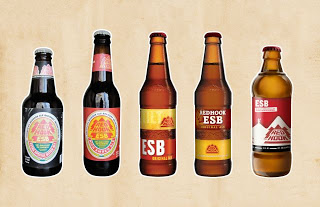
The brand followed a similar course, from funky local start-up to glossy, generic national brand. In the early phase, the logo was a major part of the brand. Evocative of the trees and mountains that characterize Seattle, it was framed nicely by rounded labels. As the brewery nationalized, it adopted sleeker bottles that downplayed the logo. They were intellectually interesting: two label strips separated by a raised barley sprig on the bottle. But they were also very neutral and indistinct--a function of being removed from place.

New Look, Old Evocations
The new bottle, as you can see, is a big departure. I spoke with Robert Rentsch, the brand manager for Redhook about what they were shooting for.
 this new bottle is definitely familiar. I thought of the old stubbies I remember from my youth--Heidelberg and Oly. This was intentional:
It is a fascinating irony that the industrial design of midcentury has now become a stand-in for authenticity. That old regional beer was anything but authentic. Yet our nostalgia for a time when Americans made things, when we were naively optimistic about rocketing into the future, is one of the most potent elements in beer design. So by referencing the industrial age--the moment America was furthest from artisanal craftsmanship--now suggests to the modern brain the idea of authenticity. The contrast between this new bottle and the old bottle is a lesson in psychology. One resonates on a subconscious level, one resonates not at all.
Names and Colors
Redhook has long used idiosyncratic labels and names to identify their beer. Some, like Blackhook Porter, had names while others like IPA did not. Some had labels that reflected the family of brands, some did not. When the company went through its last re-brand, it tried creating consistency by adding names, a fact Rentsch acknowledged wasn't a great idea:
The names--Longhammer, Rope Swing--still appear on the packages, but it wee print. I took from Robert the sense that Redhook may be planning to get rid of them entirely but is just easing them out for now.
Can a Beer Company Become a Brewery?
Perhaps the most important element of a craft beer brand is the beer itself. If the beer is indistinct, the brand will necessarily reflect that. For all its commercial success, Redhook has never had a very distinctive line of beers. This may go back to the beginning, when the vision of the two men who founded the brewery was based on a very crude sense of good beer. Across the decades, Redhook has seemed more like a company that was interested in selling beer than a brewery where good beer is made. This was particularly true when Redhook decided to go national and abandon the hyper-local Ballard Bitter, with the irresistible catchphrase "Ya sure, ya betcha!"--a reference to the Seattle neighborhood's Scandinavian influence.
Over the course of years, the beer varieties changed and morphed, the names changed, and all the while, the beer seemed to be aimed at a generic drinker who didn't want a lot of sharp edges or character. The best brands succeed because they're playing off distinctive beer, though. The brand should embody the character of the beer.
Redhook's current look is a return to place. It is distinctive and interesting (no doubt a few people will be turned off)--you'll notice it instantly on the shelf, and you'll get a fair amount of information about the brewery through the package cues. Redhook has exchanged the generic for something we could one day recognize as "Redhooky." The question is, will the beer live up to the image of an authentic Northwest beer? That's a tall order, and it will require the company to commit not only to brewing interesting, distinctive beer, but to engaging the community. Redhook's CBA partner, Widmer, has gone through a very similar process and it's taken over a decade for the people to begin to see them first as local and second as huge and national. It's a slow process.
Brand Success
I love the new packaging. It's pretty, unique, and very distinctive. (Bonus: the bottles will be great for my homebrew.) But packaging can only provide provisional branding. The brewery has to be active in delivering on the promise of the package. Redhook's new design signals an intent to be proud of its heritage as a Seattle brewery, a grandfather of craft brewing. Whether that sticks as a brand will depend on Redhook.
Update. Well, I see I'm late to the party: Brady posted his thoughts on the new brand yesterday over at the Daily Pull. One thing I would highlight in his post is the copy, which I avoided. Of particular note, the brewery seems to be trying to personify "Redhook" in what can only be called badly misguided. Let's hope that follows the beer names into the dustbin.
Company and Brand History
Redhook is gearing up to celebrate its 30th Anniversary (this year, I think, though the company wasn't incorporated until '82 nor did they sell any beer until then). Founded by a wine guy (Paul Shipman) and an ad man (Gordon Bowker), the early days of Redhook are notorious. They got a hold of an infected yeast (or, possibly, a Belgian strain) and their early beer had a lot of strange character--banana, most famously. Redhook had the advantage of being there at the start, though; Portland's Cartwright beat them by a couple of years, but folded, and Bert Grant beat them by a few months.
Novelty carried them forward through the banana-beer stage, and like many of the early breweries they went through massive growth. Within years they were expanding to meet capacity and decided speculatively to build two huge breweries--one in Washington, one in New Hampshire--to produce the prodigious quantities their growth rate suggested they'd need. By the end of the 90s, they were a national brand. Eventually, they hit a brick wall and their numbers, while impressive by craft brand standards have never approached the levels of Sierra Nevada or Boston Beer. They settled into being a big but not huge craft brewery.
The brand followed a similar course, from funky local start-up to glossy, generic national brand. In the early phase, the logo was a major part of the brand. Evocative of the trees and mountains that characterize Seattle, it was framed nicely by rounded labels. As the brewery nationalized, it adopted sleeker bottles that downplayed the logo. They were intellectually interesting: two label strips separated by a raised barley sprig on the bottle. But they were also very neutral and indistinct--a function of being removed from place.

New Look, Old Evocations
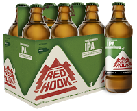
The new bottle, as you can see, is a big departure. I spoke with Robert Rentsch, the brand manager for Redhook about what they were shooting for.
"[We wanted to] celebrate our heritage. Reconnect with our roots and be true to what the brand is all about--going back to those early days. We used that as a starting point for all the decisions that came out of that. Our prior bottle was a longneck, and it was a little precious, we thought. We wanted something a little more real."For anyone who recalls beer brewed in the 70s and earlier,
 this new bottle is definitely familiar. I thought of the old stubbies I remember from my youth--Heidelberg and Oly. This was intentional:
"When we first started bottling, we were using the old style 'heritage' bottle... We considered that for awhile, but then we looked at some older, stubby-style bottles and that gave us some inspiration. It felt right for Redhook."For those of you who aren't aware of the Northwest's brewing history, it's relevant. Up until the 1970s, regional brewing was alive and well in the region: Rainier (Seattle), Olympia (Olympia), Heidelberg (Tacoma), Lucky Lager (Vancouver, WA), and Weinhard (Portland). Although most macro now is canned, bottles were one of the central ways breweries distinguished themselves then--since, obviously, the beer was all pretty much the same. Even the sizes weren't standard--Rainier offered pint bottles ("pounders"), while Heidelberg's were just 11 oz. I imagine that an old-timer, seeing Redhook's new bottles--a standard 12 ounces--would smile in recognition. Of course, younger drinkers will recognize the retro feel, too, even if they don't remember the inspirations. It's also a generally pleasing shape--and reminds Sally of a milk bottle.
It is a fascinating irony that the industrial design of midcentury has now become a stand-in for authenticity. That old regional beer was anything but authentic. Yet our nostalgia for a time when Americans made things, when we were naively optimistic about rocketing into the future, is one of the most potent elements in beer design. So by referencing the industrial age--the moment America was furthest from artisanal craftsmanship--now suggests to the modern brain the idea of authenticity. The contrast between this new bottle and the old bottle is a lesson in psychology. One resonates on a subconscious level, one resonates not at all.
Names and Colors
Redhook has long used idiosyncratic labels and names to identify their beer. Some, like Blackhook Porter, had names while others like IPA did not. Some had labels that reflected the family of brands, some did not. When the company went through its last re-brand, it tried creating consistency by adding names, a fact Rentsch acknowledged wasn't a great idea:
"Over the years we had moved in a direction where we were naming all of our beers. So: Longhammer IPA, Rope Swing Pilsner.The new brand pivots off that retro feel and goes for simplicity (itself a retro impulse). Now the four beers in the standard line just have a single name. Redhook's new design uses color to further articulate both the sense of family and individuality. The labels feature spare, monochromatic designs--one color for each variety of beer. The colors of the label continue with that midcentury feel; they're slightly washed out like the color of cheaper wrappers in the fifties. The ESB's red suggests rubber stamp. The fire-engine-red cap, a dollop of brightness, echoes the memory. I can imagine a bottle of soda from 1955 having a cap just like this. Each color plays on the beer inside--red, which has always been the color for ESB, yellow for pilsner, green for the hops of IPA, and copper for Copperhook.We were assigning made up names to our beers. We want to go back to basics by just calling it Redhook and letting the brand be front and center."
The names--Longhammer, Rope Swing--still appear on the packages, but it wee print. I took from Robert the sense that Redhook may be planning to get rid of them entirely but is just easing them out for now.
Can a Beer Company Become a Brewery?
Perhaps the most important element of a craft beer brand is the beer itself. If the beer is indistinct, the brand will necessarily reflect that. For all its commercial success, Redhook has never had a very distinctive line of beers. This may go back to the beginning, when the vision of the two men who founded the brewery was based on a very crude sense of good beer. Across the decades, Redhook has seemed more like a company that was interested in selling beer than a brewery where good beer is made.
 This was particularly true when Redhook decided to go national and abandon the hyper-local Ballard Bitter, with the irresistible catchphrase "Ya sure, ya betcha!"--a reference to the Seattle neighborhood's Scandinavian influence.
Over the course of years, the beer varieties changed and morphed, the names changed, and all the while, the beer seemed to be aimed at a generic drinker who didn't want a lot of sharp edges or character. The best brands succeed because they're playing off distinctive beer, though. The brand should embody the character of the beer.
Redhook's current look is a return to place. It is distinctive and interesting (no doubt a few people will be turned off)--you'll notice it instantly on the shelf, and you'll get a fair amount of information about the brewery through the package cues. Redhook has exchanged the generic for something we could one day recognize as "Redhooky." The question is, will the beer live up to the image of an authentic Northwest beer? That's a tall order, and it will require the company to commit not only to brewing interesting, distinctive beer, but to engaging the community. Redhook's CBA partner, Widmer, has gone through a very similar process and it's taken over a decade for the people to begin to see them first as local and second as huge and national. It's a slow process.
Brand Success
I love the new packaging. It's pretty, unique, and very distinctive. (Bonus: the bottles will be great for my homebrew.) But packaging can only provide provisional branding. The brewery has to be active in delivering on the promise of the package. Redhook's new design signals an intent to be proud of its heritage as a Seattle brewery, a grandfather of craft brewing. Whether that sticks as a brand will depend on Redhook.
Update. Well, I see I'm late to the party: Brady posted his thoughts on the new brand yesterday over at the Daily Pull. One thing I would highlight in his post is the copy, which I avoided. Of particular note, the brewery seems to be trying to personify "Redhook" in what can only be called badly misguided. Let's hope that follows the beer names into the dustbin.